For some years around the early ’90s, I was a regular attendee in Ralph Johnson’s software reading group. As such, I had a ringside seat to the development of design patterns. We read and discussed at least selections of the three seminal books by architect Christopher Alexander, Notes on the Synthesis of Form (which Ralph described, correctly I think, as a good description of the problem but the wrong solution), The Timeless Way of Building, and A Pattern Language: Towns, Buildings, Construction.
When Ralph and his coauthors began writing Design Patterns: Elements of Reusable Object-Oriented Software, we reviewed the different patterns as they were written.
In my opinion (then and now), their project had two flaws. The first was that the bullet-list-ey style is worse than Alexander’s more narrative style. Bullet lists describe, but they do not convince or, really, explain.
The other was that Alexander had a core concept, forces, that got left out. Alexander’s conception of a design problem was that there are various forces pushing in different directions and that a good pattern “balances” those forces. I’m pretty sure he used the example of a flying buttress:

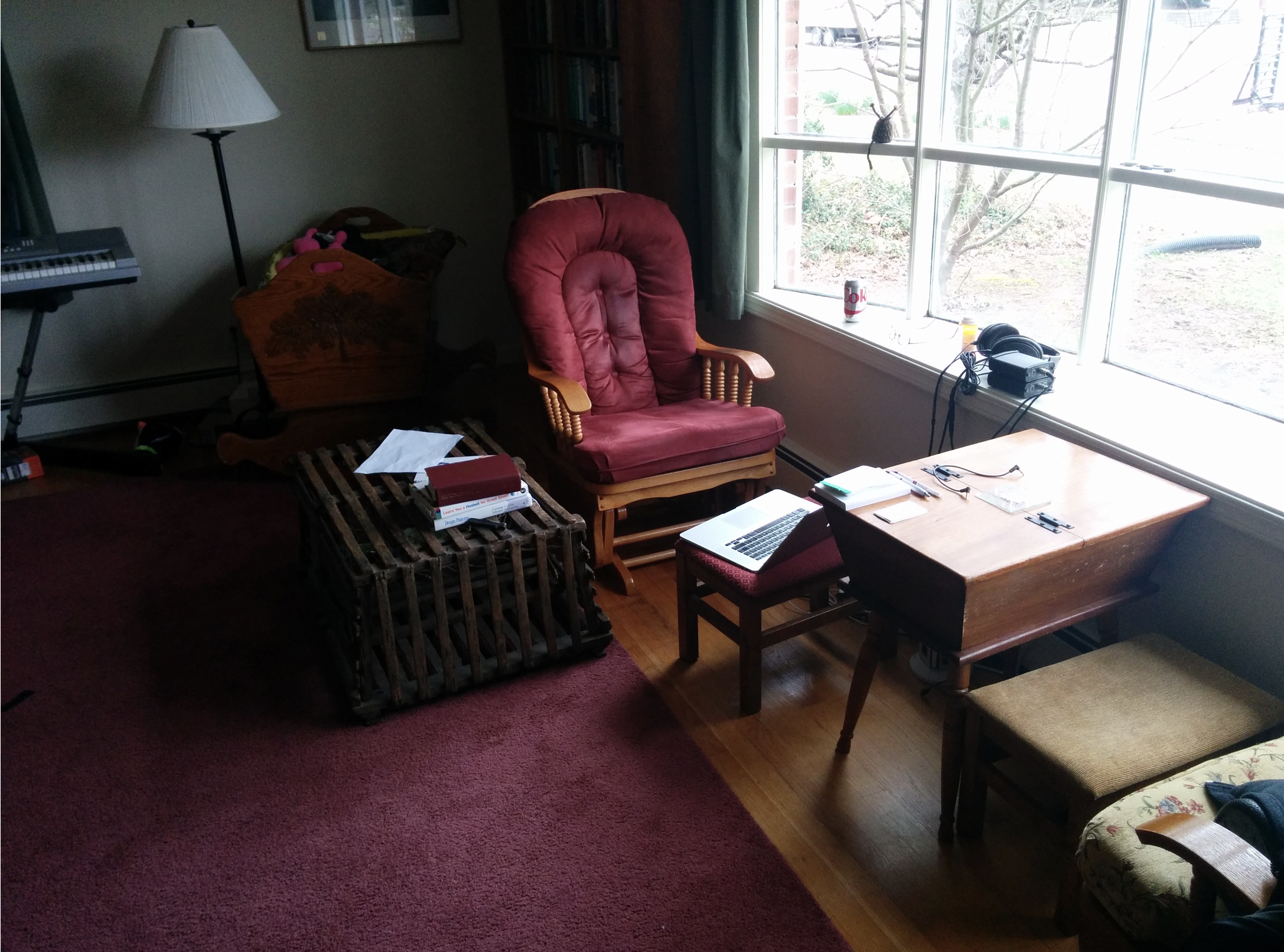
A flying buttress balances the downward force of gravity with the outward force of a wall. I’ve never tried to figure out what that actually means, so my usual example is Alexander’s Window Place pattern. Here’s my example, the Window Place Dawn calls my “nest”:

A Window Place balances three forces:
- People want to sit and be comfortable.
- But they’re also drawn to light and views of the outside.
- And people are more comfortable when they’re in “a partly enclosed, distinctly identifiable spot within a room.”
My window place is where I’ve done the bulk of my work for maybe 20 years. I used to have a proper office with a big monitor. But once we constructed my nest, I found myself not wanting to sit up there, so the office got dismantled.
The thing about patterns that describe forces is that they give the reader something of a visceral understanding of the why behind a design decision. That’s the sort of thing that allows a not-very-visual person like me to pay attention to things I’d be inclined to think are irrelevant. Like my surroundings.
The people who wrote Design Patterns understood all that good Alexander stuff, but they chose to leave it out. My belief is that they were hoping that their book would catch attention (which it certainly did) and then follow-on work would introduce people to the nuance in the concept. Which didn’t happen. Alas.
P.S. I presented a talk along these lines at DeconstructConf 2017: Patterns failed. Why? Should we care? I was rather happy with how it turned out.